‘We eat with our eyes’….
Let’s take a minute and really consider what this means. Traditionally we have associated this statement with the freshness of our food; the moment you can see all the amazing components of a dish in their individual state and the vast array of colours they collectively offer.
The truth is though, that freshness is in everything around us, it’s in our food, our fashion, our music, our art, our ideas, our attitudes and of course our architecture. What becomes particularly exciting is when there is a distinct and clear connection of freshness between two or more of these aspects at any one given time and the ability it has to excite our multitude of senses.
Bar Nou is exactly this, a clash of freshness; fresh food, fresh design and fresh architecture. Located in a city known well for its unorthodox and unique architecture, this Barcelona statement piece is ‘light and fresh’ in every sense of the term. A product of emerging architectural design quartet Maio, this small but eloquent tapas bar pays homage to the traditional Catalonian dish of ‘pa amb tomàquet’. Which for those who are unfamiliar is the amazing combination of toast, diced tomatoes, and top-shelf olive oil with garlic and salt; simple yet highly appealing, much like the design.
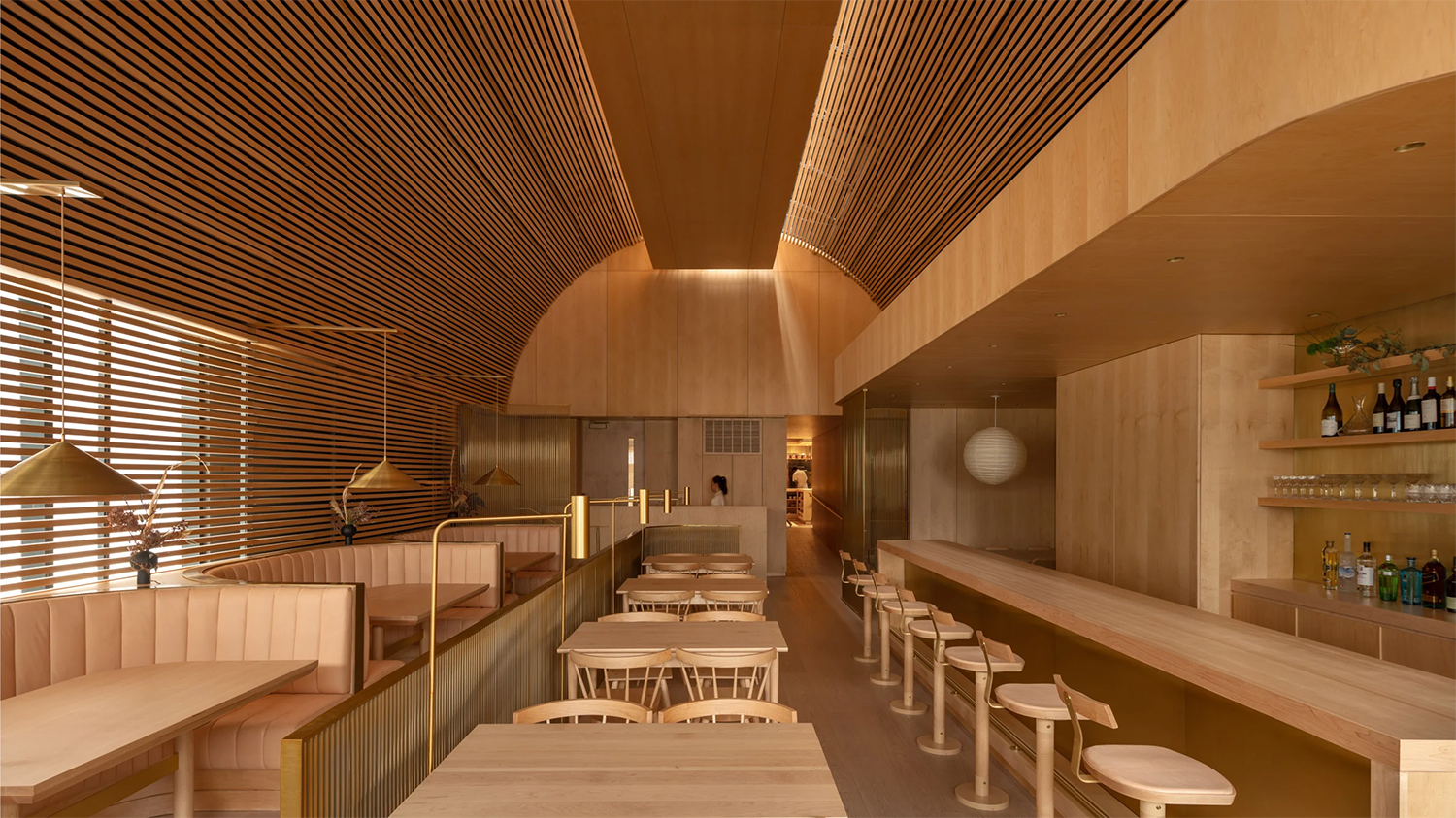
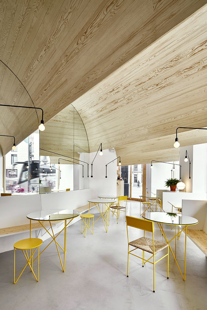
Whilst the team from Maio have managed to achieve a design which is blissfully simple, the more you break it down it’s actually full of complexities. For example the timber clad ceiling which has been arranged like a vault gives the bar an interesting sense of proportion and provides an air of ‘domesticity’, which comes back to the idea of tomatoes on toast at home. The complexity of the construction becomes even more evident through in the way the ceiling intersects with the front façade, making it an interesting feature rather than hidden, which opposes the usual way in which roofing structure is treated.
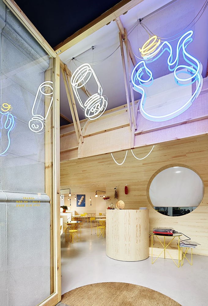
Maio have been very careful in exploring the scenographic qualities of the bar and have done this through the use of warping timber, mirrors and that unique ceiling design. By doing this they have been able to achieve a somewhat endless space within a small hole in the wall; which challenges the notion of compact European design and in particular Barcelona which has small sized city blocks to operate within and usually presents many design challenges.
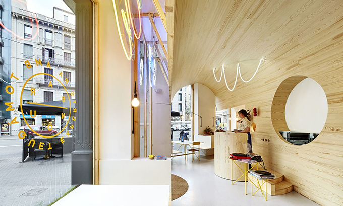
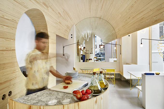
The menu mimics the design and vice versa which always creates an interesting concept when two creative entities communicate directly with each other. The pa amb tomàquet is the hero and is served in a contemporary manner. This is a strong and consistent theme as it was a request of the owner that Bar Nou would be architected in such a way that it combined contemporary design with traditional approaches.
Honouring the old in a new way is what makes this project particularly exciting. How the pa amb tomàquet is prepared in itself is more like an act of ritual, as it’s done at what is best described as a dj-booth-looking-alter placed within the core of the space. An interesting concept which becomes more evident through the overwhelming use of marble which is most widely used in churches within Spain.
.jpg)
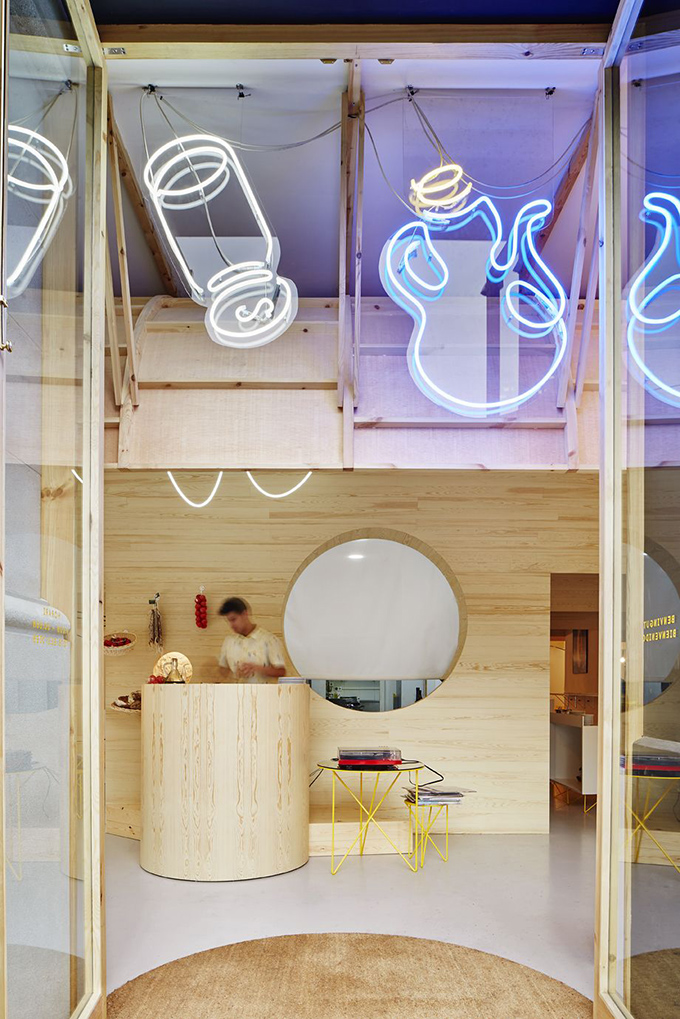
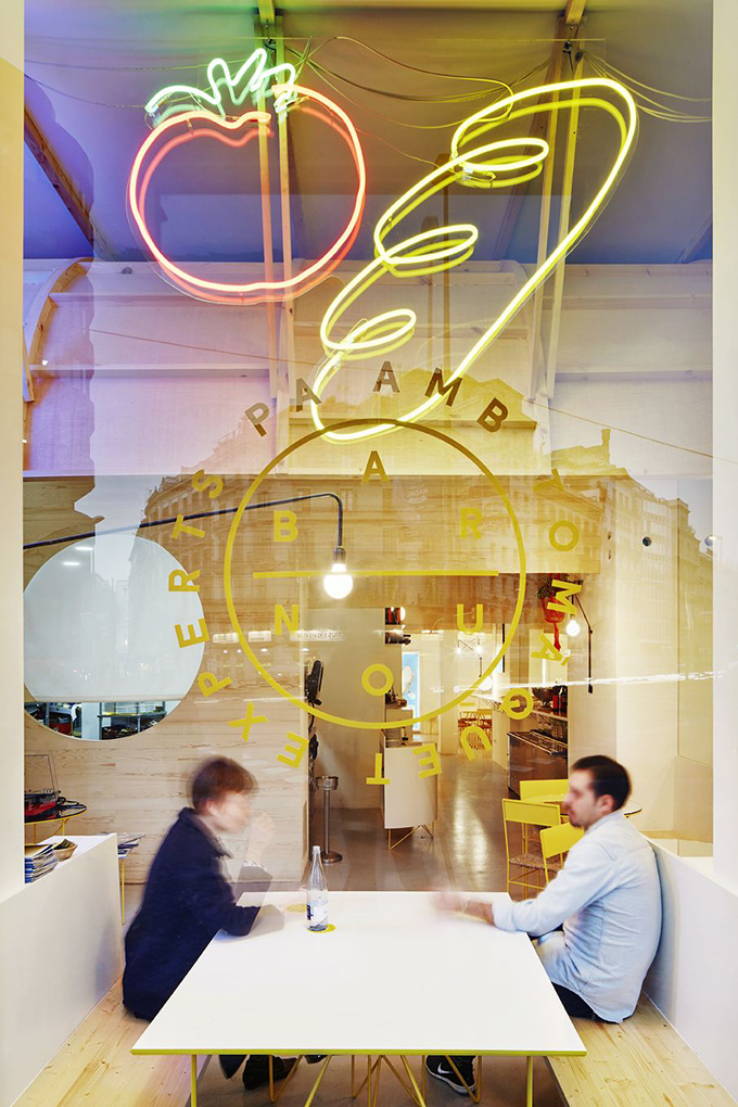
The furnishings are modern and sleek with hints of traditional Spanish domestic tradition. The lighting is purposeful and well thought out, from the down lighting over each table to the vibrant neon pictographs on the front façade which depict pictures of wineglasses, a carafe, a tomato, a loaf of bread and so cleverly draws the eyes of passers-by.
‘We eat with our eyes’, a concept that Bar Nou and the design team from Maio have now forced us to consider in a whole new light. – David Mousa.


