Close your eyes and think of what a school admin office from the 70s/80s might look like – if you can remember that far back or have seen TV series or movies from that era.
Whatever you method of recall, we are fairly certain that the images you envision are not pretty. It’s something worn out and echo-y, ugly, faded bright colours or worse, subdued and faded beiges, greens and blues, and other colours that cannot be defined. Graffiti on the tired walls that have been kicked and bumped by generations, and sad furniture ready for the dumpster. Closed doors, dark and uninviting corridors.
When you then compare these visions with the images of the Piazza Dell Ufficio (Italian for plaza of the office) school administration office renovation of Caroline Chisholm Catholic College in Melbourne’s Braybrook neighbourhood, you’d almost like to go back to school.
Knowing they were looking at a project in need of serious intervention, Brunswick, Australia-based Branch Studio Architects got to work on the 275 square-metre (2,960 sq. ft) space, frozen in time circa 1970, and ended up changing absolutely everything.
They imagined an open and inviting space where staff, teachers and students would actually like to work and interact and hang out.
Taking a popular approach in design, Branch Studios team imagined an Italian piazza that acts as a draw and a gathering place that is often created around a monument, statue or a big tree.
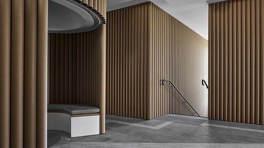
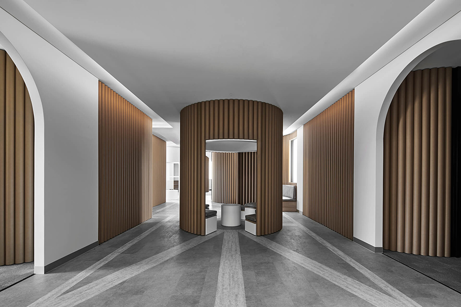
They created a central focus, a ‘clock tower’ and positioned the offices in the periphery of the open space. They broke the cubicle mold and created flexible spaces that could function as individual offices, meeting areas, shared workspace and hot desks.

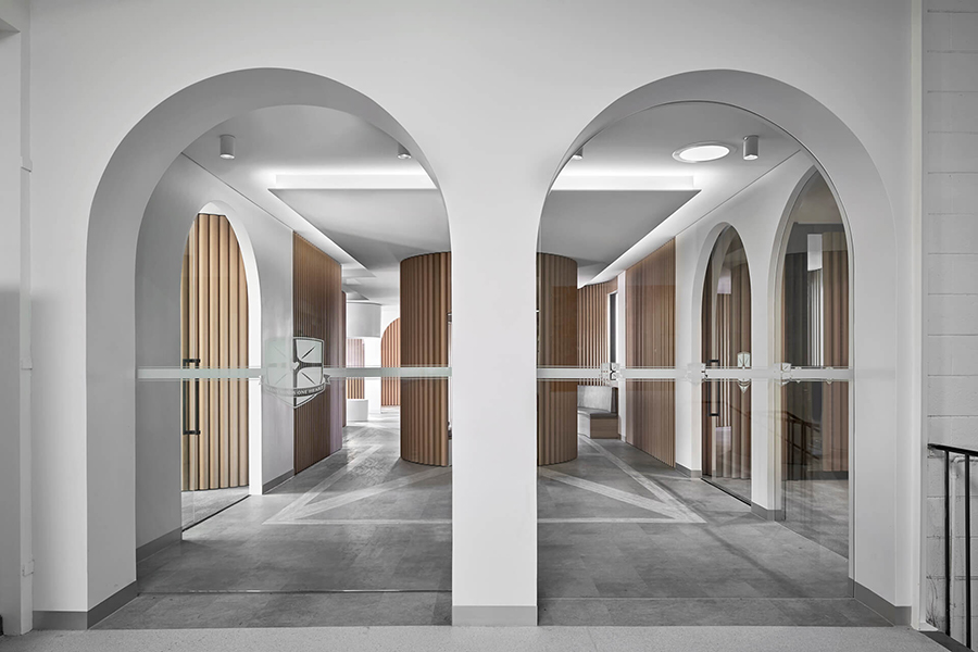
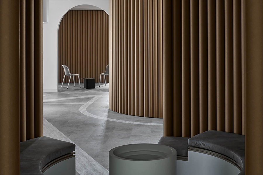
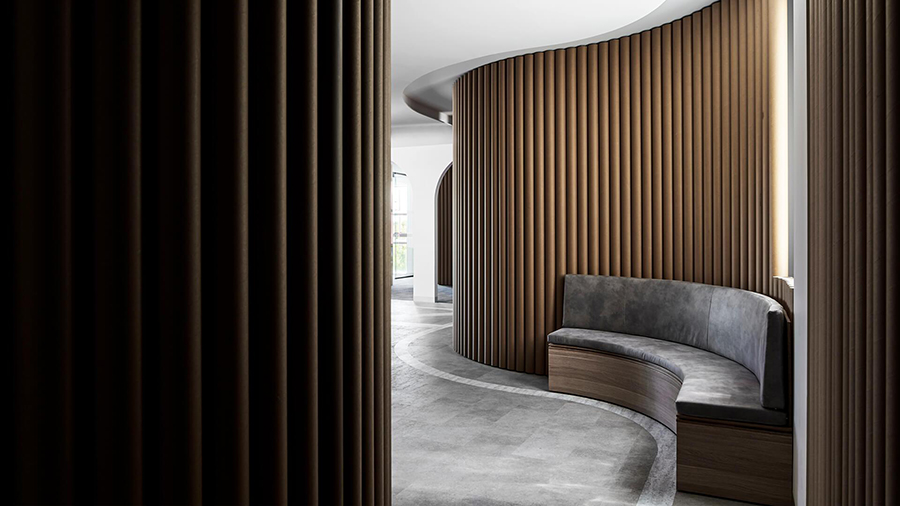
The clock tower is a curved gazebo with a small table inside that resembles a clock face, surrounded by an upholstered circular bench. Further following the Italian theme, they created porticos and arched entryways while leaving as much open to the central piazza as possible. Natural light is flowing throughout the space that now looks about twice the size it did before.
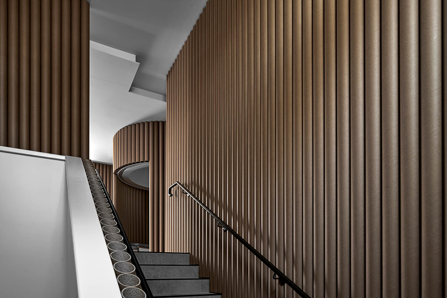
The dominating, fun aspect of the project is the extensive use of inexpensive cardboard tubes that brings to mind Japanese architect Shigeru Ban’s emergency shelters and art installations made of similar tubes.
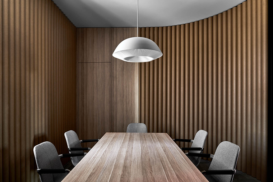
We love the subdued colour palette and the fact that the office looks so decidedly grown-up and elegant. We imagine the staff and students walking in to this space feeling more appreciated and proud. Efficiency and new ways of working will also be likely results from this newly reconfigured environment. Tuija Seipell.
Photography by Peter Clarke
